
Olive Interiors is a residential design studio crafting premium, family-centric homes built to age gracefully, not chase trends. The rebrand aligned strategy, voice, and visuals to reflect their true positioning, considered, warm, and enduring, so the brand now matches the depth of the work.
Olive Interiors
Olive Interior
Services Provided
Research & Strategy
Verbal Identity
Visual Identity
Marketing Collaterals
Industry:
Interior Design Studio
Duration:
45 Days
Introduction
A studio built on the belief that homes should outlast trends, Olive Interiors has spent a decade crafting residential spaces across Mumbai that families actually live in, not just photograph.
Olive serves discerning homeowners ready to invest in their forever spaces. Their process runs deeper than mood boards and material samples; it starts with understanding how a family moves, gathers, and grows. The results are homes that feel right on day one and even better on year ten.
"We've always known who we are in the studio. We needed the outside world to see it too," the founders shared. Challenge accepted.

Olive had built something real a loyal client base, a portfolio of genuinely livable homes, and a reputation that spread through word of mouth. But the brand told a smaller story. Generic visuals. Forgettable messaging. Marketing materials that looked like every other interior firm in the city.
The work deserved better. So did the team presenting it.
We spent eight weeks in research mode. Founder sessions. Client interviews. Competitive analysis across Mumbai, Bangalore, and Delhi.
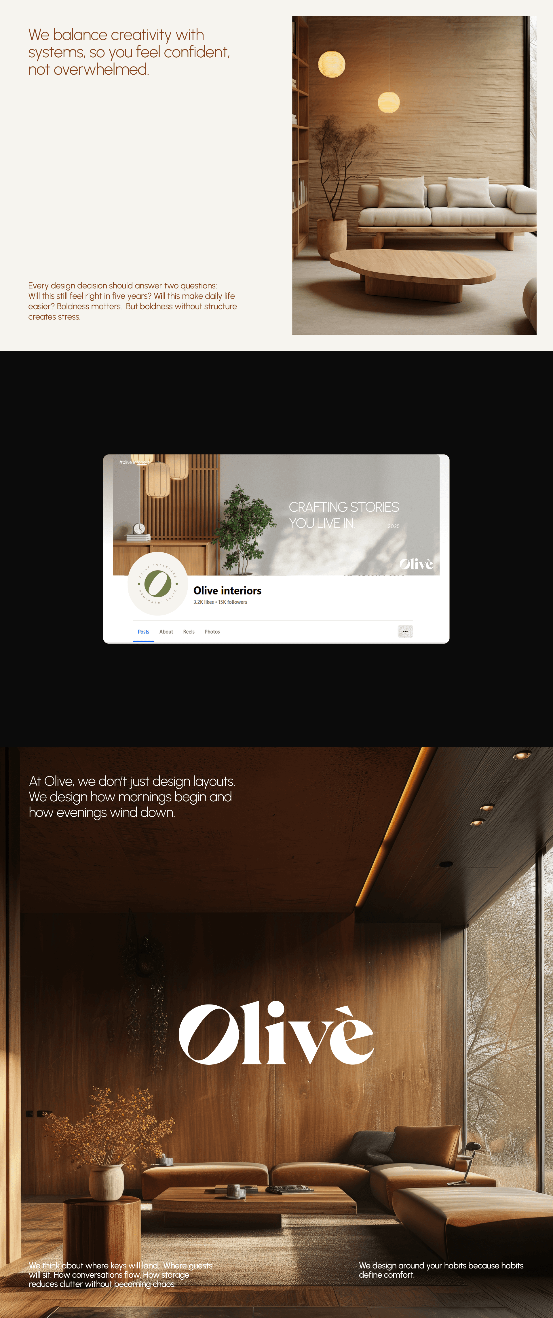
What emerged was clarity. Olive wasn't competing with the flashy maximalist studios or the budget decorators. They occupied a specific space: premium but approachable. Sophisticated but warm. Designed to endure.
Three words became the foundation:
Considered. Warm. Enduring.
Every creative decision filtered through these.
The old messaging defaulted to category clichés"transforming spaces," "bringing visions to life." Safe. Forgettable. Could belong to anyone.
The new voice speaks like the founders actually do. Confident without being cold. Knowledgeable without being preachy. Human.
The line: Homes that grow with you.
Not interiors. Homes. Not designed for you. Grow with you. The distinction matters.

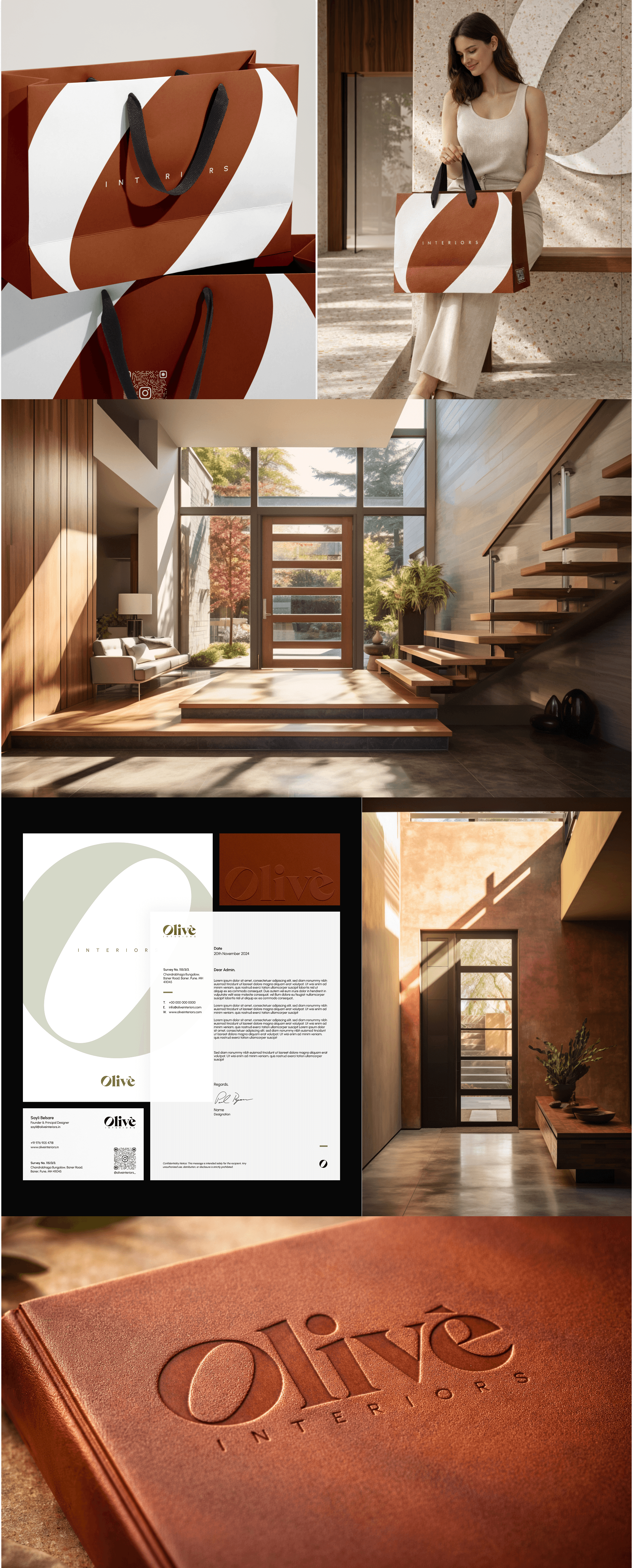
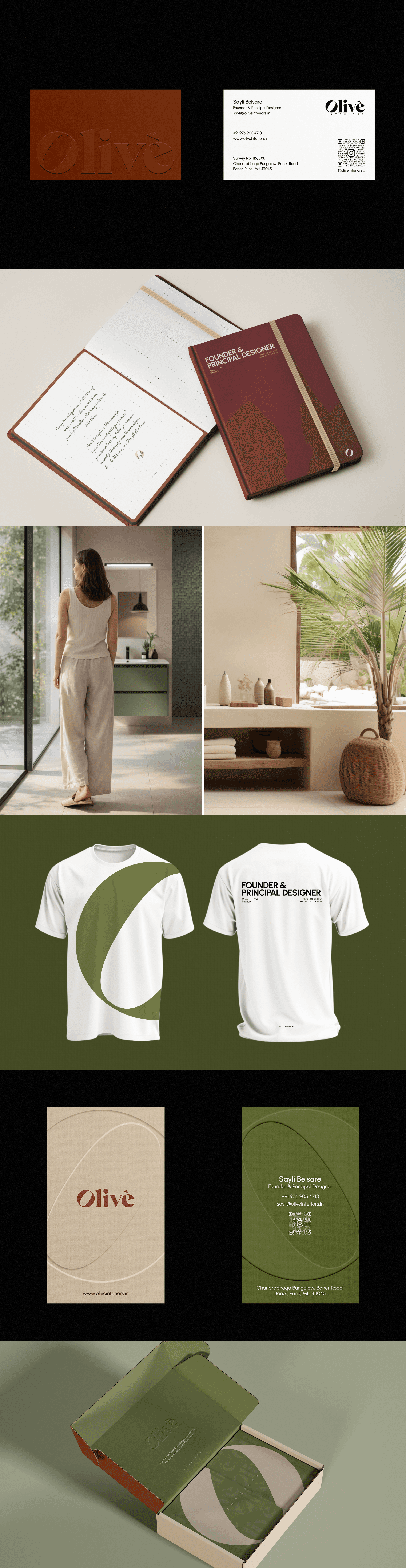
The previous identity played it safe muted grays, generic sans-serif, stock photography. It didn't reflect the warmth clients experienced working with Olive.
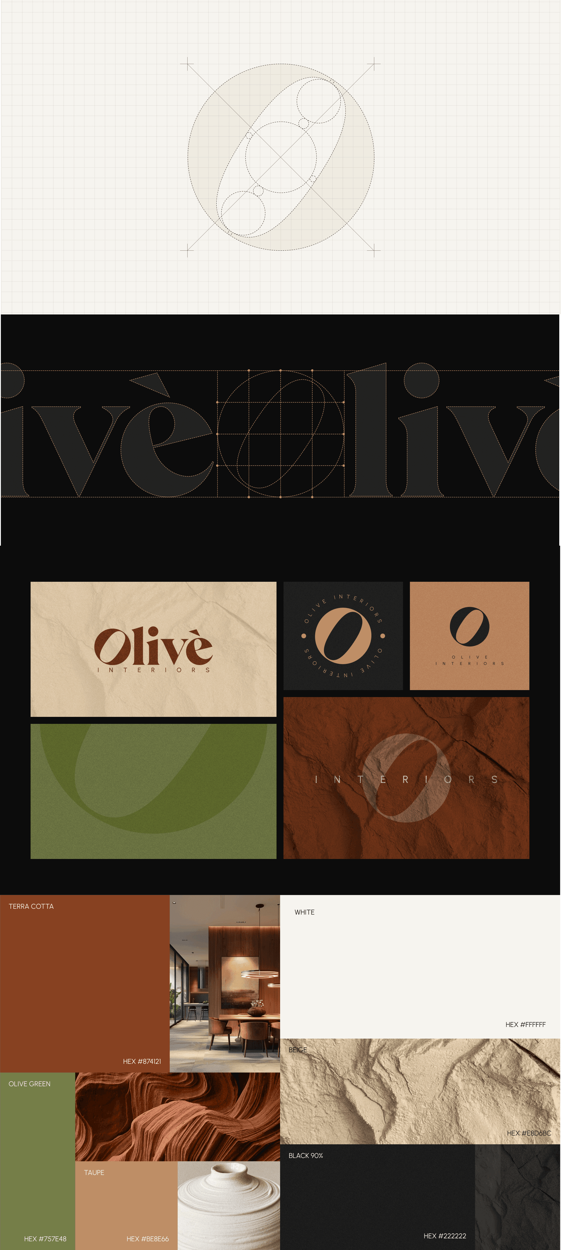
The new system leads with intention. A refined wordmark paired with a distinctive "O" mark subtle nod to the olive, works at every scale from site signage to Instagram avatar.
Color moves from safe neutrals to confident territory. Deep olive green anchors everything. Warm sand softens. Terracotta accents add energy. The palette feels like the interiors Olive actually creates.
Typography pairs an editorial serif for warmth with a clean sans for clarity. Residential and professional in equal measure.
Photography direction threw out the magazine-perfect rulebook. Real homes. Real light. Morning sun on a breakfast table. A reading corner with a half-finished book. Life, not staging.


Client Welcome Kit The first impression, elevated. A branded notebook for inspiration gathering. A questionnaire designed to feel like a conversation. A small olive plant a living piece of the brand.
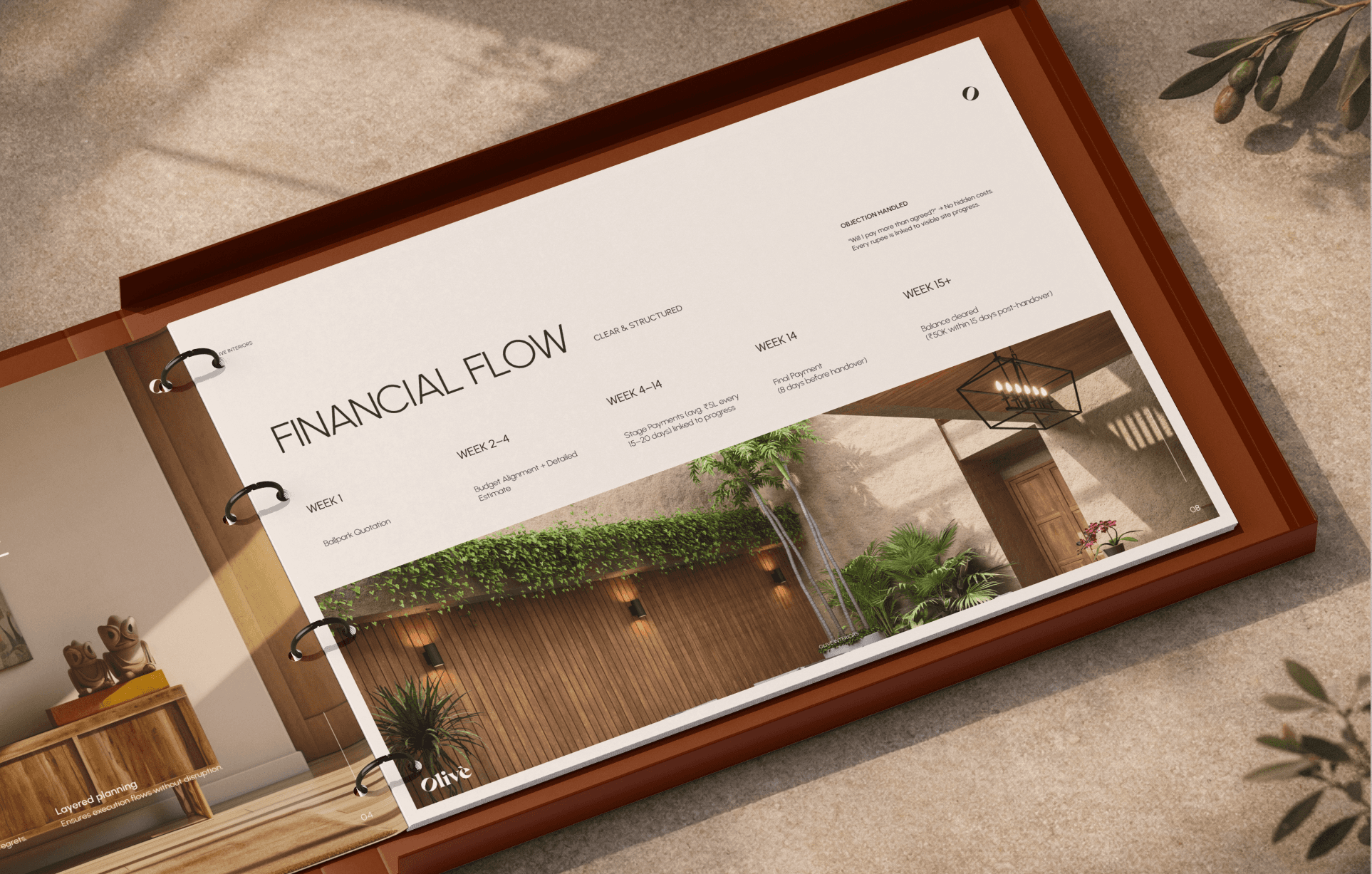
Proposal Templates Systems that let the team move fast without calling in design support. Polish on demand.
Social Content Framework Project reveals, process insights, team moments. Templates that maintain consistency while staying easy to execute.
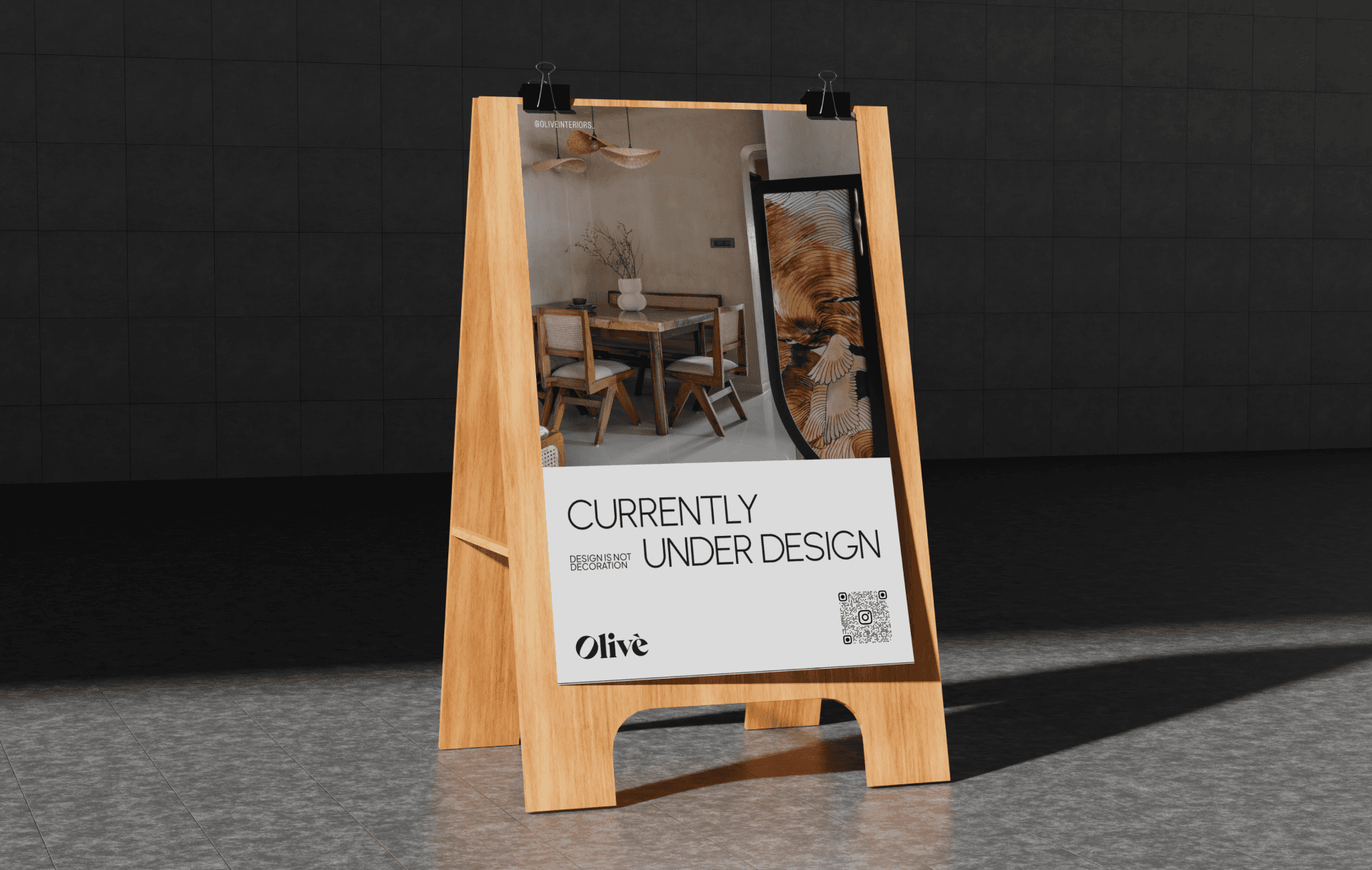
Site Signage & Team Apparel Brand presence from the first site visit. Every touchpoint considered.
A brand that matches the work. Clients who understand Olive's value before the first meeting. A team that feels proud handing over a proposal.
The outside world finally sees what was always true inside the studio.
"For years, there was a gap between the work we delivered and how we presented ourselves. Proposals felt generic. Our Instagram looked like everyone else's. We were winning projects despite our brand, not because of it.
Black Chérie didn't just give us a new logo. They understood what makes us different and built a system around it. Now when clients walk into our studio, they already get it. The brand does the heavy lifting before we say a word.
Best part? Our team actually uses the templates. That never happened before."
- Sayali Belsare , Founder, Olive Interiors

